Ryan Miller

Hello! I am a Business Intelligence Developer with an interest in data analysis and web development
View My LinkedIn Profile
Chicago Crime Analysis
Here I performed an analysis of crime within Chicago based on publicly provided data from the city of Chicago. My main goal was to learn more about crime throughout Chicago by exploring the data and then to build a dashboard using Power BI to allow others to also explore the data. My secondary goal was to create a machine learning model to predict whether a new crime will get an arrest, so I could gain some experience applying machine learning to real-world data. Unfortunately, I wasn’t able to achieve a significant increase over the baseline accuracy (covered in the ML Results section). But I was able to build an interactive dashboard, shown below, and included instructions on how to set up the data source in the Dashboard Setup section.

Overview
This project is broken up into four main files:
- Data_Preprocessing.ipynb
- Or Data_Preprocessing_PySpark.ipynb if you have PySpark installed.
- Data_Exploration.ipynb
- Predicting_Arrests.ipynb
- Chicago_Crime_Dashboard.pbix
The first two Jupyter Notebooks go into detail on how and why I chose to preprocess the data and what I found when exploring the data respectively. The summaries from the notebooks are in the Data Preprocessing and Data Exploration sections below.
The third notebook, Predicting_Arrests.ipynb, shows some of the attempts I made at predicting whether an arrest will occur for a new crime and talks about the results of my attempts. In ML Results, I will reiterate what was covered in the notebook, why I did what I did, and my future goals for this model.
Finally, I will go over how to set everything up, so you can explore the data yourself using the Power BI dashboard I built in the Dashboard Setup section.
Data Preprocessing
As of 3/10/2020, the dataset provided by the city of Chicago on crime (excluding murders) contains over 7 millions rows and 22 columns. This dataset contained the homicides, about 10,000, from the last 20 years. To facilitate early exploration of the data and focus on more recent, relevant trends, I removed crimes from before 2010, unneeded columns, and rows with nulls. The reduced dataset contained just under 3 million rows of crimes
After reducing the size of the dataset, I cleaned up the text columns by manually matching values of each column with a smaller subset of categories in excel, mapped the Community Area ID’s to their name and group (e.g. Community Area 8 maps to Near North Side and Central) based on this Wikipedia page, and added some categorical columns based on the date of the crime.
Also added in the Community Area population sizes from the 2010 Census to allow for an approximated Crimes/Homicides per Capita calculation. Unfortunately, this data isn’t provided year over year and as of 3/30/2020, the 2020 Census isn’t available, which is why I needed to use 2010 population sizes.
As of 11/6/2020, I included a new data preprocessing notebook with the data cleaning rewritten using PySpark. With PySpark and SparkSQL, I was able to reduce the time to clean the data to under 1 minute (this only includes cleaning the entire dataset and storing the result to a CSV; i.e. the last cell in the notebook).
If you have Apache Spark and PySpark installed and are able to run it locally using an iPython notebook, running the Data_Preprocessing_PySpark.ipynb notebook will save you some time while still giving the same result.
Data Exploration
I performed a brief exploratory analysis of the cleaned dataset. I looked at a few different columns in the cleaned dataset to get an initial idea of whether or not they would be helpful features for predicting whether there will be an arrest for a new crime. The columns I believe will be most helpful are the community area, type of crime, and the year the crime occurred.
I also explored the raw counts of crimes and homicides, along with the per capita counts, to see if there were any interesting trends. One of the most interesting trends I want to point out is how the raw counts of crimes and homicides can be deceiving. Looking specifically at the plots showing the Community Areas with the Least and Most Crimes with both the raw counts and crimes per capita in the All Crimes and Homicides by Community Area section, we can see that Fuller Park is among the community areas with the least amount of crime, but when looking at the crimes per capita (the raw counts divided by the 2010 Census population sizes), Fuller Park has more crime per capita than all the community areas in Chicago.
Another thing I found interesting was the low arrest rate. The arrest rate for all crimes in the city of Chicago was only 24.96%, which shocked me. The arrest rate for homicides was higher at 37.18% but still lower than I thought it would be (though that’s probably because I’ve been watching too many unrealistic cop shows).
ML Results
My goal for this model was to accurately predict whether an arrest will be made for a crime in the city of Chicago.
Because of the large amount of data available, I decided to rely on non-parametric models. Two of the models I tried were the Random Forest algorithm (sklearn’s implementation) and the Feed-Forward Neural Network (using tensorflow.keras’ Sequential model with Dense and Dropout layers). To speed up the model tuning phase, I only used the most recent 100,000 crimes from the training set.
After performing hyper-parameter tuning on both models, I was able to achieve 87.7% accuracy. At first glance, this seems to be a good score, but the validation set I was using during hyper-parameter tuning only had an 19.4% arrest rate, so just predicting no arrest every time would achieve an accuracy score of 80.6%. In order to ensure that the issue wasn’t the subset of data I was using to train the models, I also trained both using the entire training set but wasn’t able to achieve a better accuracy.
Because the best I was able to achieve was only 7% higher than the baseline validation accuracy (predicting no arrest every time), it appears that either the current dataset isn’t the best for predicting arrests or the techniques I was using weren’t enough to help the models perform better.
In the future, I hope to reattempt this problem when I have learned new techniques to help with imbalanced class distributions. One idea I have as of 3/29/2020 is using over and under-sampling techniques.
Dashboard Setup
Prerequisites
You need to have Python installed on your computer and be able to run python scripts through your terminal.
python example_script.py
You also need to have Power BI Desktop installed. If you don’t already, you can download it for free here.
Installing
After cloning the repository, navigate to the folder, create and activate a virtual environment, and install the required packages in the requirements.txt file.
For Windows machines:
cd path/to/repo/folder
python -m venv env
cd env/scripts
activate
cd ../..
python -m pip install -r requirements.txt
Running the Dashboard
Before you can use the dashboard, you need to first download both the general crimes dataset and the homicides dataset. Save these CSV files as crimes_general.csv and crimes_murders.csv, respectively, in the Data folder in your local copy of the repo.
Afterwards, run the data preprocessing script to create the data source for the dashboard.
python data_preprocessing.py
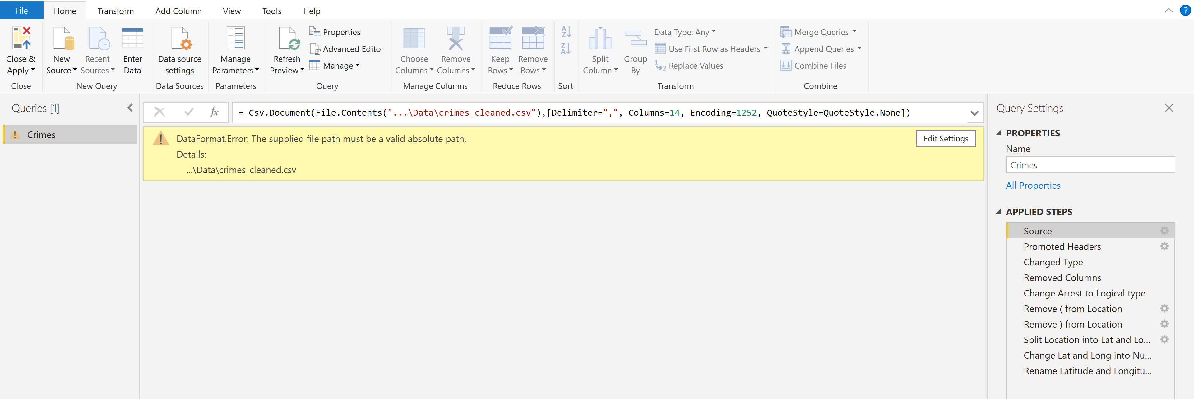
After creating the data source, open the dashboard and go into the query editor. In the Source step of the query, change the data source file path to the path of the crimes_cleaned.csv file.
Finally, click Close and Apply, and once the query is done refreshing, the dashboard will be ready to go!
Built With
- Pandas - The framework used to preprocess the data
- Apache Spark - The framework used to quickly preprocess the data
- Matplotlib - The framework used to visually explore the data
- Power BI - The software used to build the dashboard
- Scikit-Learn - The framework used to build the machine learning models
- Keras - The framework used to build the deep learning models
Author’s Info
- Portfolio - https://ryan-kp-miller.github.io/
- Email - ryan.kp.miller@gmail.com